Christmas in a mix of old & new. Rag rugs, tablecloths, Christmas decorations & pastel colors that create a charming harmony.
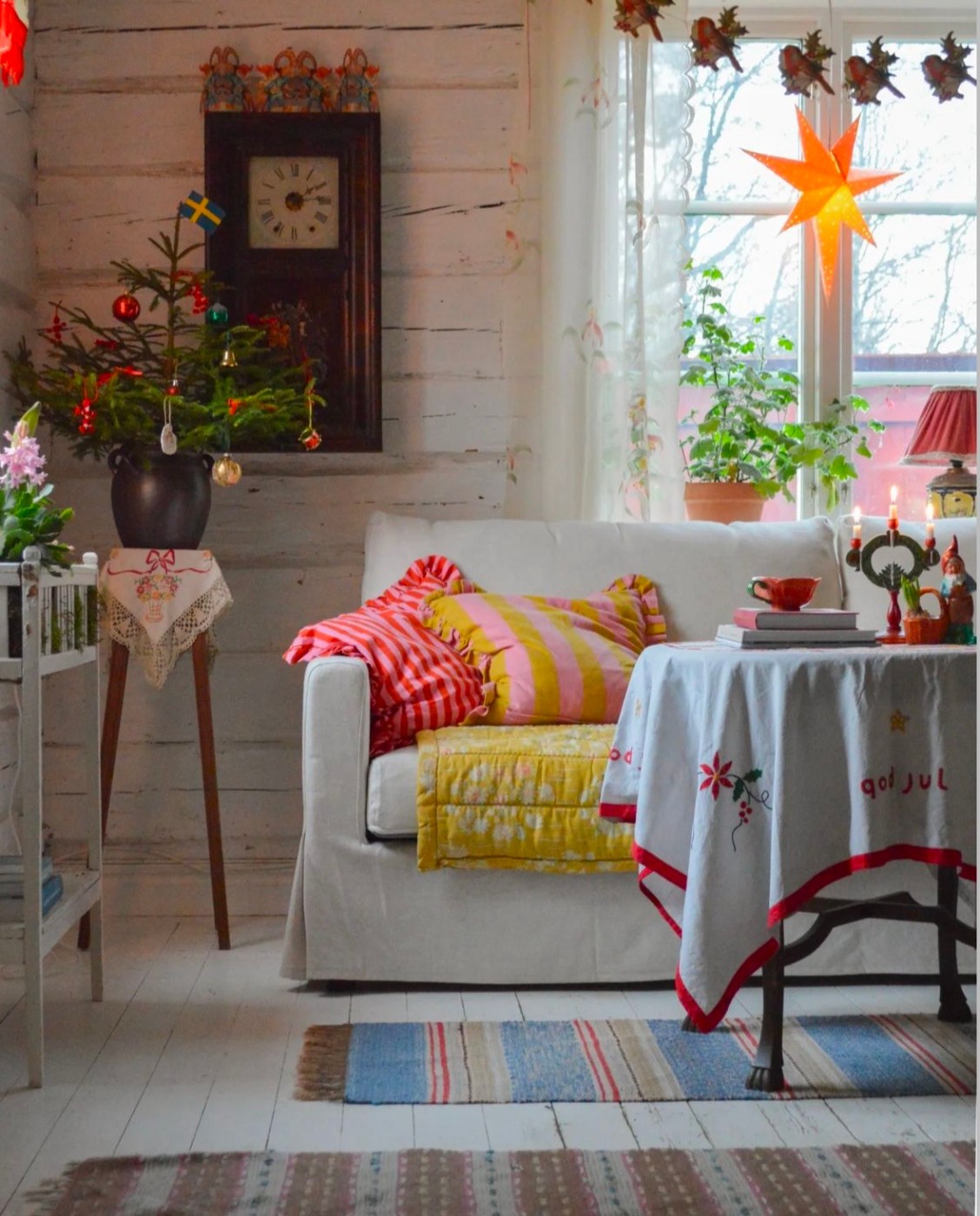

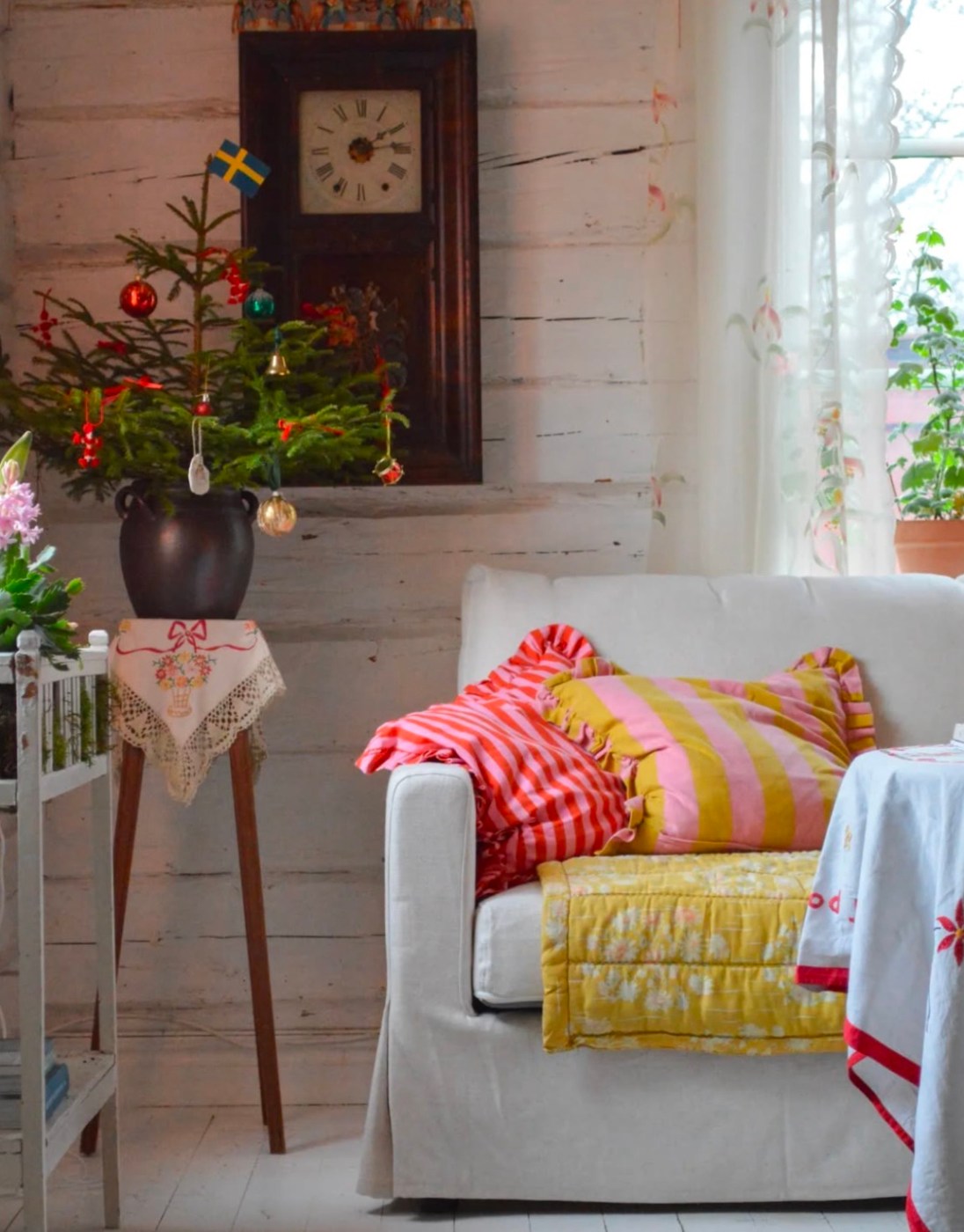


Christmas in a mix of old & new. Rag rugs, tablecloths, Christmas decorations & pastel colors that create a charming harmony.
A coherent color scale creates a calm impression & sense of harmony.

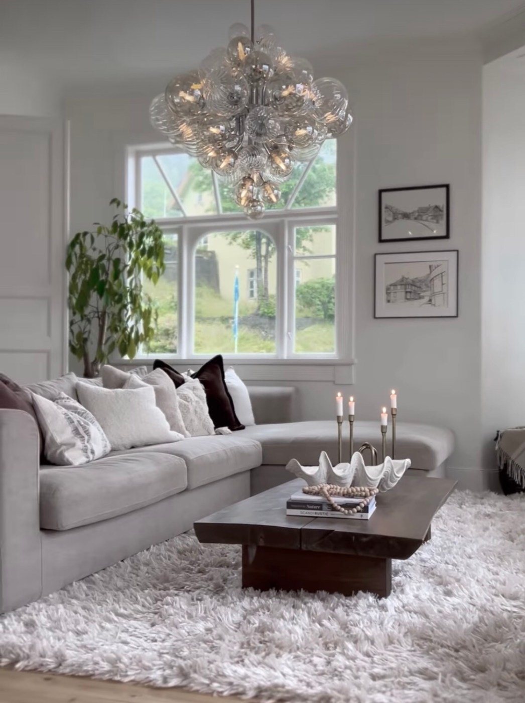

It’s certainly a skill set to create a setting that looks so inspiring & well thought out with limited colours – very impactful. An environment with depth, character, harmony & creativity.

It’s really nice to work with colors in the same color scale into the interior. It creates a balanced, calm & harmonious effect.
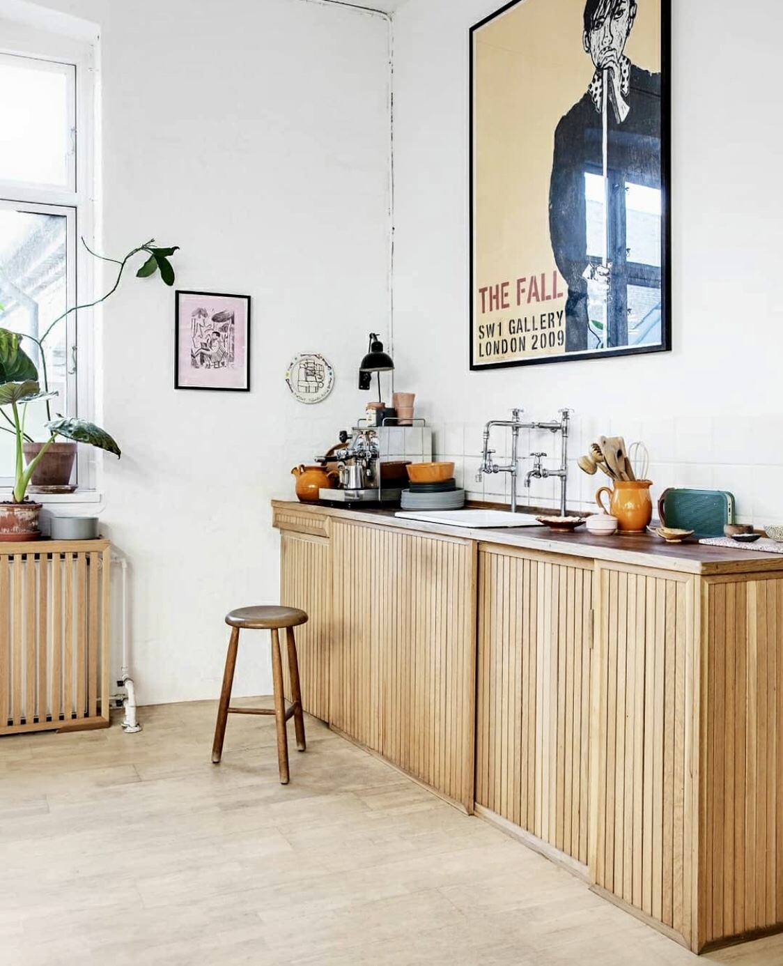
Some people avoid letting white shades dominate a room. That’s a shame – white together with wood & a few dots with darker tones create a calm that captures the beauty of the harmony that arises.

