
Here’s somewhat mixed caramel colours that feels relatively current considering the spring warmth & the various shades that’s slowly emerging. Some of the images are a little paler pastels while others have more color in them. It’s a bit like the colors during the day depending on the sun’s strength & how the light falls. Or as the new Iphone 5 C, colours that looks like ice cream, to the point that you almost want to taste them.
These is colors that feels right at the moment, they fall to the taste, so to speak.
 Sweets in white flat box / chic-deco.blogspot.com.au
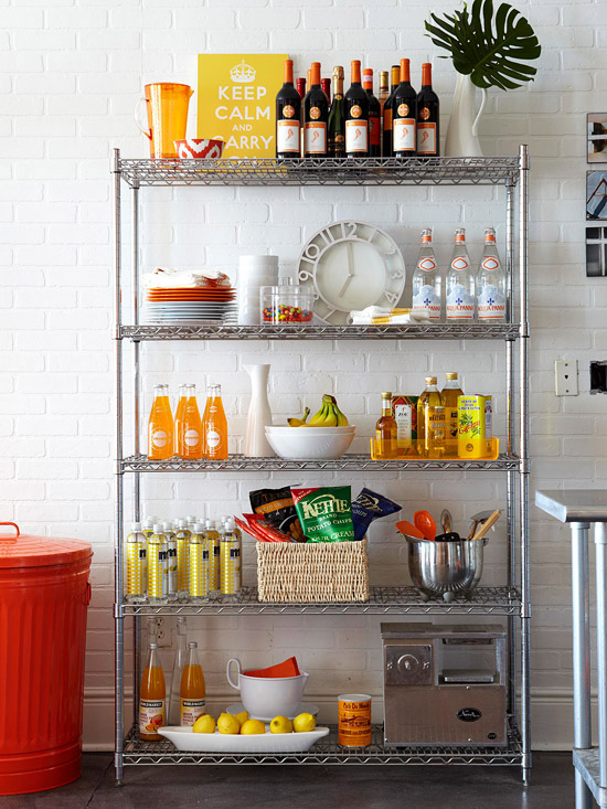 Pantry styling / bhg.com
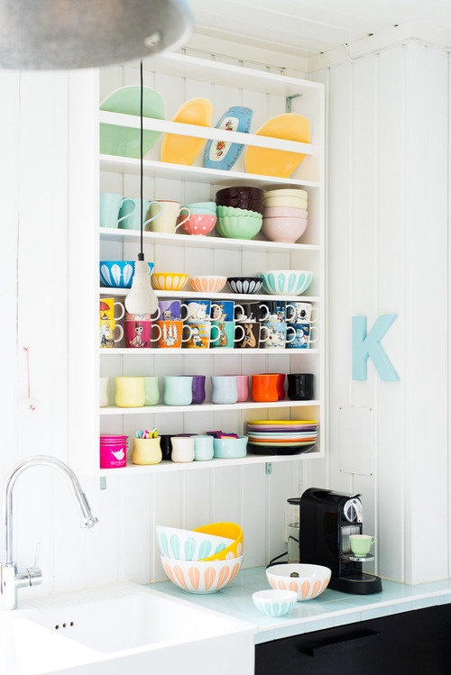
 Nice styling above the kitchen counter / ohjoy.blogs.com
 Soft candy colors / schoener-wohnen-farbe.com
 Nicely combined soft colours / thedesignfiles.net
 Bunk bed with nice beddings / garnethill.com
 Pastels matching the sea / jotun.no
 Geometric style / google.com
 Perfect place for collections / myidealhome.tumblr.com
 Nice little corner / hannaflyckt
 Exciting mix of patterns / flickr.com
 Simply styling / frenchbydesign.blogspot.com
 Inside & outside in similar style / fancy.com
 For the dearest ones / decopeques.com
 Matching bracelets / coronado via fancy.com
Take care / Marie


